
In his essay, The Visual Rhetoric of Data Displays: The Conundrum of Clarity, Charles Kostelnick examines the visual rhetoric of data displays and how its dramatic change in the last fifty years has affected rhetorical approaches. Kostelnick theorizes that there has been a democratization effect of data design technology. Similar to what Richard A. Lanham explains in the Economics of Attention, our perception of the world has been become increasingly shaped by the synergistic relationship between data and design. Our understanding of the data we are presented with hinges on the clarity of its presentation. The design of the pie chart, spread sheet, or graph is equally important as the data it presents.
We are immediately drawn to Tufte’s maxim that “[g]raphical excellence consists of complex ideas communicated with clarity, precision, and efficiency,” that it “gives to the viewer the greatest number of ideas in the shortest time with the least ink in the smallest space” and that it “requires telling the truth about the data”
Tufte’s maxim roughly outlines Quintilian’s guide to good rhetoric. Ideally, good visual rhetoric serves a utilitarian purpose to condense complex ideas and communicate them efficiently. Displaying data is an effective way to present facts that transforms a passive activity such as reading into an interactive experience. The great number of visual data displays at our disposal has enabled us to “move and delight” our audience like never before. The genre of graphing software has expanded to include a number of different charts and graphs such as:
- Bar
- Horizontal Bar
- Pie
- Line
- Area/Mountain
- Surface
- Scatter
- Radar
- Donut
With so many options to choose from, it is often difficult to determine which display best presents and communicates the data. Since our brains are all hard-wired differently, there is no universal answer to this. However, scientists have researched which method produces optimal clarity to which designers can use to gauge which type may best suit their purpose.
Kostelnick observes that out of all this comes ethical considerations. “Designers, unconstrained by graphical standards or professional oversight, can manipulate charts and graphs for their own ends” (Kostelnick, 3). Tufte’s “Lie Factor” measures the discrepancy between the size of the data and its visual representation. In other words, the apparent size of the data is not the same as the actual size of the data.
In another class, our teacher showed us how graphs can often times distort the data. The example of 3-D graphs display data as volume. Area only goes up by square in a linear dimension (πr^2). But volume goes up by cube (length x width x height). The distortion here is exacerbated by foreshortening and improper scaling. MSN and Yahoo appear to tower over Google, when in reality they are only up by 5%.
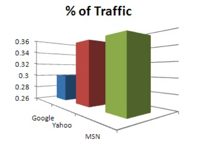
3-D Graph. Envs21 ppt.
Data can also be misconstrued when it is presented as counts instead of rates. The first graph (pink) may appear to indicate that younger drivers are involved in far more fatal car crashes than elderly drivers. Of course, the graph doesn’t reveal the total number of drivers in each age range. There are far more younger drivers on the road than elderly drivers. If the data is presented as a rate (blue), then we can see that the rate of fatal car crashes is actually higher amongst elderly drivers.
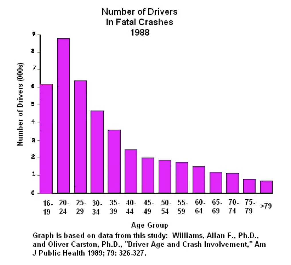
Data presented as Count, Envs21 ppt
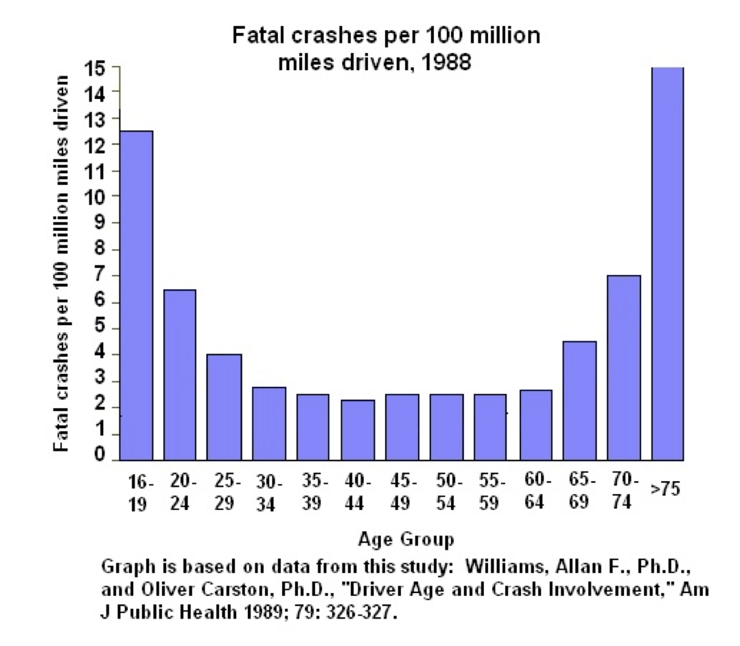
Data as rate, Envs21 ppt
3 responses to “The Pitfalls of Data Display”