
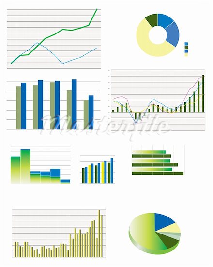
This image demonstrates the various kinds of ways a designer can show information using data displays. Source: masterfile.com
A picture might be worth a thousand words, but a graph might mean even more. In our age of technology, we are able to see millions of images on the Internet and even create our own, generating a new and more analytical way of examining information. Data displays, such as graphs, maps, and charts, are some of these millions of images that create an interactive environment for Internet readers. However, our Internet society might take the information from these data displays for granted, not being able to recognize when the information is inaccurate.
Charles Kostelnick, an English professor at Iowa State University, addresses the new widespread technology of data displays in his article “The Visual Rhetoric of Data Displays: The Conundrum of Clarity.” He discusses how these forms of communication provide an interactive, clear visual of the information being relayed. The main goal of using data displays is to “ensure the optimal transmission of data from designer to user” (Kostelnick 117). This form of communication relies on both the designer and the reader in order to communicate the message desired.
One of the aspects of data displays I found interesting was the connection Kostelnick makes between the relaying of information and ethos. Ethos is one aspect of Aristotle’s rhetoric, focusing on how an orator’s character and morality impact his or her credibility when addressing an audience. Originating from ethos, the designers of this information have the moral responsibility to make sure that the facts they are representing within their charts and graphs are accurate for the readers to interpret. As Kostelnick states, “This rational, efficient rhetoric of data design embodies an intrinsic ethical component because it implies that readers deserve a full, unadulterated disclosure of the data and that designers have a moral imperative to provide it” (118).
Yet, how do we know if the information relayed is actually true? Especially with current technology, it is very simple to create a graph using the basic computer programs such as Microsoft Office, and manipulating a graph to get the desired results is simple as well. It is not always easy to detect true information from false information that designers have created to provide examples or evidence for their research.
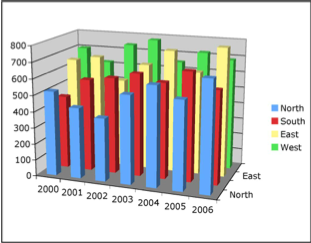
This is an example that Kostelnick gives of a complicated graph, one that conflicts with the ethos of the designer. Source: Kostelnick
Readers take these graphs for granted though. For instance, if a reader sees an article with multiple graphs and charts, his or her first thought is probably that this author is credible. We connect data displays with professionals and researchers, people who have had much education and are highly intelligent. Especially when their graphs are very complicated and incomprehensible, we usually link it fact that it is probably too complex a subject for us to fully understand. Since we do usually consider complex, professionally made data displays like these trustworthy, we disregard the fact that they could be lying to us. Therefore, we are looking past what the graph actually communicates to us as readers, and we give the designers more credit than they deserve.
Sometimes complex graphs do tell the truth, readers just have a hard time understanding them. However, Kostelnick suggests that the simpler and easier the graph is to understand, the more credit should be given to the designer, as it is the designer’s responsibility to clearly relay the information to the reader. He comments saying,
By eliciting a subjective response from readers, this ancillary aesthetic element engenders two rhetorical effects. First, it makes displays more inviting to readers because readers are naturally drawn to elegant displays; and second, it bolsters their credibility because beauty and truth are cognate qualities”. (119)
Simpler, clearer, and more concise materials are always easier to understand, and therefore, it gives the designer much more credit and ethos.
So how much can we truly trust the information behind these charts and graphs? A reader must interpret the data displays as they would any other information on the Internet – with caution. We can never taken anything we see on the Internet for granted, unless we truly know the source is credible and trustworthy for their information. While the Internet has given us so many great technological advances and new ways to communicate, we still need to be cautious about all that we see and believe on the Internet.