This is my last post. My goodbye. The following graphic is one I created in hopes of bringing awareness to an issue I researched in a recent paper for my CTW course.
Unfortunately I had to cut up the infographic to get it into a blog post. The best way to view it is through the below link. But without further ado I present to you my multimodal project.
HERE is the link to the infographic in it’s full glory.
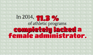
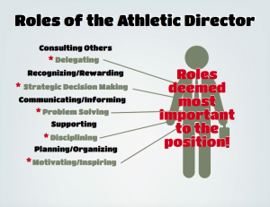
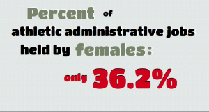
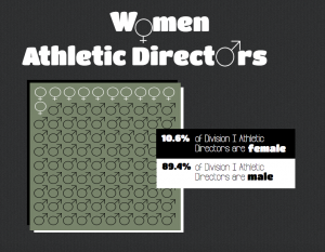
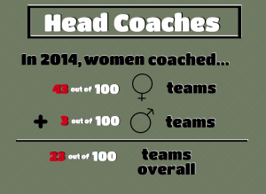
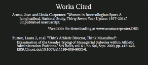
Is it everything you imagined? I know that I hyped this last blog post up but to be honest this took a lot longer than it looks. Getting everything to be natural to read while keeping in mind the message of the overall work is not as easy as it seems. The end product is supposed to look effortless, but I spent hours playing with hoe to arrange text, pick the colors of the text, format the shape of the text and choosing the best font.
It may seem ridiculous but the font has so much to do with the tone of the piece. For example, just look at the difference between the whole piece and the works cited. I used a font that was ” all business” because it signals the audience that it is the works cited and that they don’t have a responsibility to read it.
All in all, this assignment was really entertaining and relaxing to create. As a photographer and art minor I love using visual techniques to create a message, so I used this assignment as stress relief when I was overwhelmed with schoolwork.
Hope you enjoyed my content on the blog overall!
Alaina
